Back in April 2018, I mentioned the idea of two computing revolutions:
“There are two computer revolutions. One revolution is trying to abstract out the technology and present people with an easy, touch interface to accomplish specific tasks. Using your phone to take a picture, send a text message, post to social media, play YouTube videos, etc. are all examples of this type of technology. It’s probably the dominate form of computing now.
The other revolution are the complex computing tools that are being developed that cannot be used via a touch interface.”
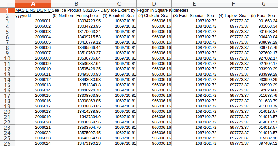
The programming language R is an example of the second type of revolution. One simple task it can perform is reformatting data. It can take a long column of numbers from a source such as the MASIE sea ice data that is essentially unintelligible to people, and it can change it into a form that makes for easy comparison across years by day for a single sea.

While this data manipulation is a powerful tool, this is only the tip of the iceberg. The real power comes from the kind of computing and visual representation that comes after the data has be reorganized. For example, once we manipulate the data into the above format, we can then create a correlation matrix that shows which years are closest in any given year.

And this chart is generated by five lines of code, two of which create a pdf:
sea_rcorr <- rcorr(as.matrix(sea_table[, -c(1)]))
sea_coeff <- sea_rcorr$r
pdf(paste0("./output/sea-ice-in-", sea, "-correlation-", sea_date, ".pdf"))
corrplot(sea_coeff, method="pie", type="lower")
dev.off()
We can then build on this step and take the correlations between the five years closest to the current year and create a chart looking at a specific period of days, like so:

Looking at this chart, we can make a pretty accurate guess as to what the extent of sea ice will be on Day 100 because we can see that the years 2014, 2015 and 2016 are the closest years for comparison and we get easily see by how much.
R is a really powerful tool, particularly if you have to do repeated calculations on data that frequently updates and you need to present it in a format that helps decision making. It is far superior than anything I’ve ever done using spreadsheets. But, it does take time to set-up initially, and it is difficult for individuals to develop the expertise to do it effectively if they are not part of a team, like the one described in the article I posted earlier today: How the BBC Visual and Data Journalism Team Works With Graphics in R. Still, this is a much better tool for certain kinds of problems that is worth looking into if you find yourself looking at complex data to make decisions.
Try It Yourself
Download RStudio for the operating system you use. Take the R script I used to manipulate the data and generate the charts above, copied below. You should be able to cut and paste the script over into the Source pane in RStudio. You’ll also need to install the relevant libraries over in the Packages pane on the lower right side. Then, since the script is written as a function, you’ll also need to call the function in the Console pane – the box in the lower, left corner – once you have loaded it with something like:
> sea-ice(sea="Greenland_Sea", day_one=1, last_day=365)Just the relatively easy exercise of getting this to work could serve as a starting place to get a sense of how R works and how you might incorporate it into your workflow. It’s worth giving a try.
Note 1: You will need to replacing Greenland Sea with the area of interest to you, i.e., “Northern_Hemisphere”, “Beaufort_Sea”, “Chukchi_Sea”, “East_Siberian_Sea”, “Laptev_Sea”, “Kara_Sea”, “Barents_Sea”, “Baffin_Bay_Gulf_St._Lawrence”, “Canadian_Archipelago”, “Hudson_Bay”, “Central_Arctic”, “Bering_Sea”, “Baltic_Sea”, “Sea_of_Okhotsk”, “Yellow_Sea”, or “Cook_Inlet”.
Note 2: This was my first serious attempt to write anything useful in R. I have some minor experience writing in Perl, Python, and a few other computer programming languages that helped make this easier to do. Still, it is worth noting I’m not a programmer. Writing programs in R is a skill that can be learned by many people and be useful to some degree to anyone.
# sea-ice.R
# Original: November 2, 2018
# Last revised: December 3, 2018

#################################################
# Description: Pulls MASIE ice data, limits by sea,
# and runs a correlation matrix to determine which
# five years have trend lines that are closest to
# current, and presents recent data in a graph.
# Best use is in generating trend lines and being
# able to visually compare current year with
# previous years.
#
# Note: The prediction algorithm, ARIMA, is
# commented out because it is of questionable
# utility and makes this script run much slower.
# I left it in as a bad example for people
# that want to try machine prediction.

rm(list=ls()) # Clear memory
gc()

# Set Variables in Function
# "Northern_Hemisphere", "Beaufort_Sea", "Chukchi_Sea",
# "East_Siberian_Sea", "Laptev_Sea", "Kara_Sea",
# "Barents_Sea", "Greenland_Sea",
# "Baffin_Bay_Gulf_St._Lawrence", "Canadian_Archipelago",
# "Hudson_Bay", "Central_Arctic", "Bering_Sea",
# "Baltic_Sea", "Sea_of_Okhotsk", "Yellow_Sea",
# "Cook_Inlet"

# Replace defaults in function to desired,
# or call the function from console
sea-ice <- function(sea="Greenland_Sea", day_one=300, last_day=365) {
  days_start <- day_one
  days_end <- last_day
  sea_of_interest <- sea
  sea_date <- Sys.Date()

  #################################################
  # Preliminaries

  # Define basepath and set working directory:
  basepath = "~/Documents/programs/R/forecasting"
  setwd(basepath)

  # Preventing scientific notation in graphs
  options(scipen=999)

  #################################################
  # Load libraries. If library X is not installed
  # you can install it with this command at the R prompt:
  # install.packages('X')
  library(data.table)
  library(lubridate)
  library(stringr)
  library(ggplot2)
  library(dplyr)
  library(tidyr)
  library(reshape2)
  library(corrplot)
  library(hydroGOF)
  library(Hmisc)
  library(forecast)
  library(tseries)

  #################################################
  # Import, organize and output csv data

  # Testing
  # masie <- read.csv("./data/masie_4km_allyears_extent_sqkm.csv", skip=1, header=TRUE)

  # Import csv using current masie data
  masie <- read.csv("ftp://sidads.colorado.edu/DATASETS/NOAA/G02186/masie_4km_allyears_extent_sqkm.csv", skip=1, header=TRUE)

  # Assign column names, gets rid of (X) in column names
  colnames(masie) <- c("yyyyddd", "Northern_Hemisphere", "Beaufort_Sea", "Chukchi_Sea",
              "East_Siberian_Sea", "Laptev_Sea", "Kara_Sea", "Barents_Sea", "Greenland_Sea",
              "Baffin_Bay_Gulf_St._Lawrence", "Canadian_Archipelago", "Hudson_Bay",
              "Central_Arctic", "Bering_Sea", "Baltic_Sea", "Sea_of_Okhotsk", "Yellow_Sea",
              "Cook_Inlet")

  # Separating day and year
  masie_tmp <- extract(masie, yyyyddd, into = c("Year", "Day"), "(.{4})(.{3})", remove=FALSE)

  # Selecting the columns of interest
  sea_select <- c("Year", "Day", sea_of_interest)

  # Pulling column data from masie and putting it in the data frame
  sea_area <- masie_tmp[sea_select]

  # Adding column names, changing sea name to sea ice
  colnames(sea_area) <- c("Year", "Day", "Sea_Ice")

  # Reshape the three columns into a table, fix names, and export csv file
  sea_table <- reshape(sea_area, direction="wide", idvar="Day", timevar="Year")
  names(sea_table) <- gsub("Sea_Ice.", "", names(sea_table))

  # Creating a cvs file of changed data
  write.csv(sea_table, file=paste0("./output/sea-ice-in-", sea, "-table-", sea_date, ".csv"))

  #################################################
  # Correlation Matrix
  sea_rcorr <- rcorr(as.matrix(sea_table[, -c(1)]))
  sea_coeff <- sea_rcorr$r

  pdf(paste0("./output/sea-ice-in-", sea, "-correlation-", sea_date, ".pdf"))
  corrplot(sea_coeff, method="pie", type="lower")
  dev.off()

  # Takes current year, sorts the matches, take the year column names,
  # and then assigns them values for the graph
  sea_matches <- sea_coeff[,ncol(sea_coeff)]
  sea_matches <- sort(sea_matches, decreasing = TRUE)
  sea_matches <- names(sea_matches)
  current_year <- as.numeric(sea_matches[1])
  matching_year1 <- as.numeric(sea_matches[2])
  matching_year2 <- as.numeric(sea_matches[3])
  matching_year3 <- as.numeric(sea_matches[4])
  matching_year4 <- as.numeric(sea_matches[5])
  matching_year5 <- as.numeric(sea_matches[6])

  #################################################
  # Prediction using ARIMA
  #
  # Note: Of questionable utility, but included as a curiosity.
  # Other possibilities for prediction: Quadradic Regression and
  # Support Vector Regression (SVR). SVR examples are easy to find with Google.
  # For R script for quadradic prediction for sea ice, see:
  # http://ceadserv1.nku.edu/data/Rweb/RClimate/#Ocean%20Ice:

  # sea_data <- sea_area # Importing initial MASIE area data

  # if (front_year == "TRUE") {
  #  sea_data <- filter(sea_data, Day <= 200)
  # } else {
  #  sea_data <- filter(sea_data, Day >= 165)
  # }

  # sea_data <- sea_data[, -c(1,2)] # Remove Year & Day
  # sea_ts <- ts(sea_data, start = 1, frequency=200) # ARIMA needs time series
  # sea_data <- as.vector(sea_data)
  # sea_fit <- auto.arima(sea_ts, D=1)
  # sea_pred <- forecast(sea_fit, h=200, robust=TRUE)
  # sea_plot <- as.data.frame(Predicted_Mean <- (sea_pred$mean))
  # sea_plot$Day <- as.numeric(1:nrow(sea_plot))

  # ggplot() +
  #  ggtitle(paste("Predicted Sea Ice Extent")) +
  #  geom_line(data = sea_plot, aes(x = Day, y = Predicted_Mean)) +
  #  scale_x_continuous()

  #################################################
  # Historic Trends Graph
  sea_graph <- sea_area

  # Filtering results for 5 year comparison, against 5 closest correlated years
  sea_graph <- filter(sea_graph, Year == current_year | Year == matching_year1 |
                      Year == matching_year2 | Year == matching_year3 |
                      Year ==matching_year4 | Year == matching_year5)

  # These variables need to be numerical
  sea_graph$Day <- as.numeric(sea_graph$Day)
  sea_graph$Sea_Ice <- as.numeric(sea_graph$Sea_Ice)

  # Filtering results into period of interest
  sea_graph <- filter(sea_graph, Day <= days_end)
  sea_graph <- filter(sea_graph, Day >= days_start)

  # The variable used to color and split the data should be a factor so lines are properly drawn
  sea_graph$Year <- factor(sea_graph$Year)

  # Lays out sea_graph by day with a colored line for each year
  sea_plot <- ggplot() +
    ggtitle(paste("Incidence of Sea Ice in", sea_of_interest)) +
    geom_line(data = sea_graph, aes(x = Day, y = Sea_Ice, color = Year)) +
    # Uncomment this if you have a sensible forecast algorithm.
    # geom_line(data = sea_plot, aes(x = Day, y = Predicted_Mean, color="Forecast")) +
    scale_x_continuous()

  sea_plot
  ggsave(filename=paste0("./output/sea-ice-in-", sea_of_interest,
                         "-plot-", sea_date, ".pdf"), plot=sea_plot)

  summary(sea_graph)
  sd(sea_graph$Sea_Ice)

  return(sea_graph[nrow(sea_graph), ncol(sea_graph)])
}